Overview
Sérêvène - Miami Beach
Logotype design & visual identity
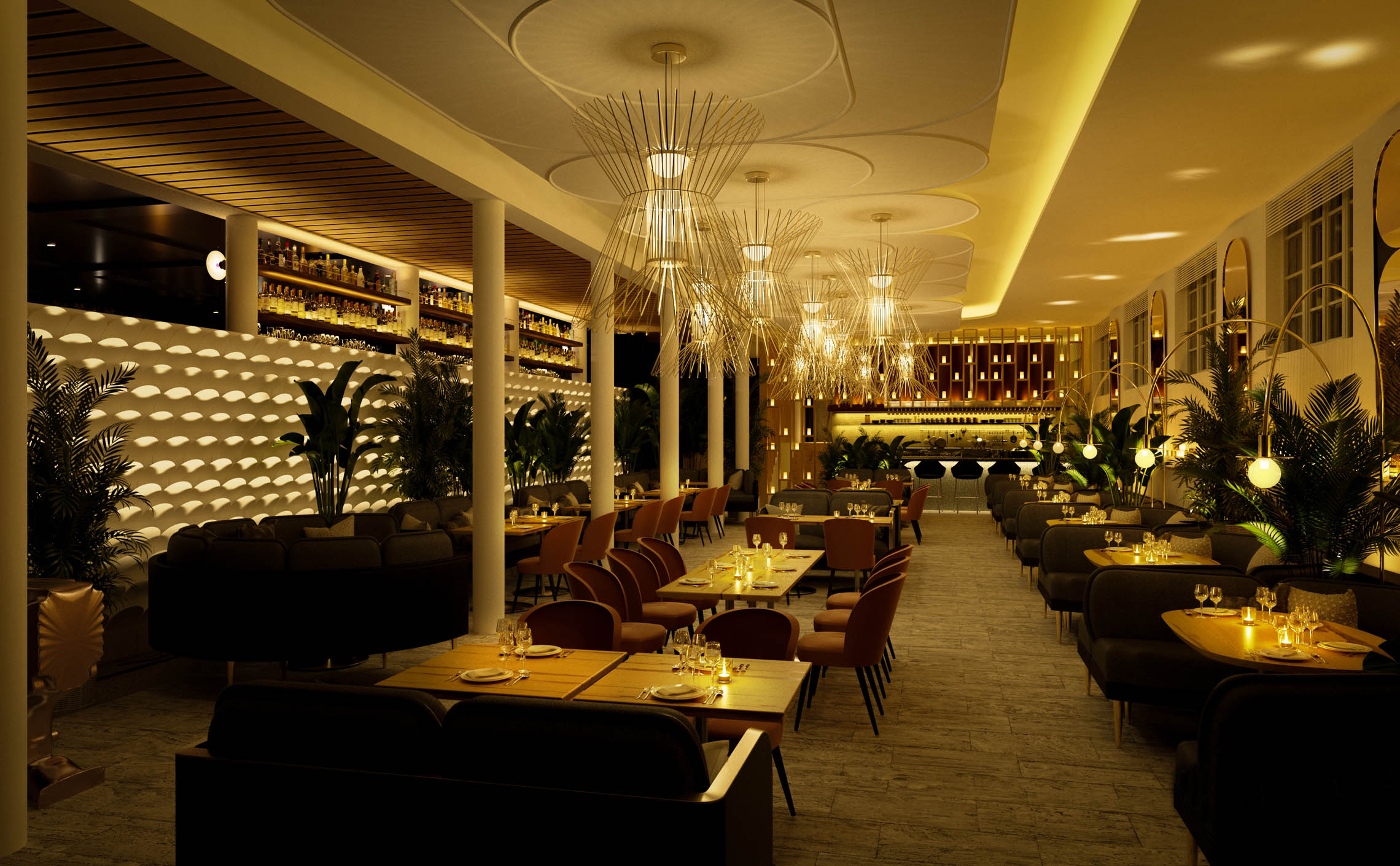
The Sérêvène restaurant by acclaimed and famous Chopped winner, Chef Pawan Pinisetti, is what you get when a Japanese izakaya meets a French rôtisserie.
Unexpected flavor combinations set the scene for the restaurant situated within Hotel Greystone on Collins Avenue, Miami Beach.
Sérêvène is rated 5 stars out of 5, on both Opentable and Tripadvisor.
I was tasked with creating a striking identity for the restaurant, bridging French and Japanese influences, smoothly integrated into the Hotel Greystone visual universe.
Inspirations
Japanese izakaya meets French rôtisserie
I won't delve into my client's detailed recommandations since the brief was very straightforward and crystal clear: France, Japan, and an elegant solution to blend them.
My main inspiration was calligraphy as both Japan and France have a very peculiar culture around loose yet energetic brush strokes.
Another bridge between these two countries was the love of gardening, be it the tight French gardens or the Japanese zen gardens. Also, there is a rich botanical component inside the restaurant, many plants placed between the tables and flora paintings on the walls.
Finally, if a monogram was to be extracted, a nice wink to Japanese culture could be in the form of the Hanko, the tyipcal red stamp used as signature on official papers and paintings.

Rough Sketches

Modularity
A restaurant requires the flexibility to apply its branding across a wide array of materials and objects.
The logotype is designed with versatility in mind.
Its modular structure through various lockups allows seamless adaptation across diverse mediums.
Color Scheme Hierarchy
The color scheme for the restaurant, is derived from the Hotel Greystone scheme, still Miami vibes, only with more organic and earthy tones.
Typograhy
Primary Font: Montserrat
To ensure continuity, we also chose Montserrat, same as for the Hotel Greystone as the primary font due to its versatility and historical resonance.
Secondary Font: Marvel
Complementing Montserrat, we selected Marvel as the secondary font for its slender and elegant sans-serif design. Highly legible and suitable for small texts and body copy, Marvel adds a touch of refinement to the typographic hierarchy, ensuring clarity and visual harmony across all brand communications.
Applications
In situ applications of the branding on various mediums and situations.


Unused Alternatives
During the creation process, I of course explored alternative options. These stayed at an early stage of development and are by no means refined.


