Overview
Ohlala Pâtisserie - Bucharest
Logotype design & visual identity
Ohlala is a gourmet French pastry shop located in the center of Bucharest, Romania.
Created by Alina Petrea who was taught at the prestigious Ritz-Escoffier culinary school in Paris, Ohlala aims to delight the locals with refined French delicacies and sweets.
Process
About the name
First of all, we had to remain fully conscious that "Oh la la" is a well-known French expression and widely used as a brand name.
For good reasons: it is an easy and efficient way to signify both excitment and frenchness along with a touch of sexyness. On the flip side, it is harder to differentiate oneself.
Ohlala is also a very "rythmic" name, evoking a sensation, a sense of surprise. The Oh of surpise, then the lala of lingering delight.
To transition from semantics to the graphic realm, we could see Ohlala as a musical decrescendo, first the exclamation, then softer tones:

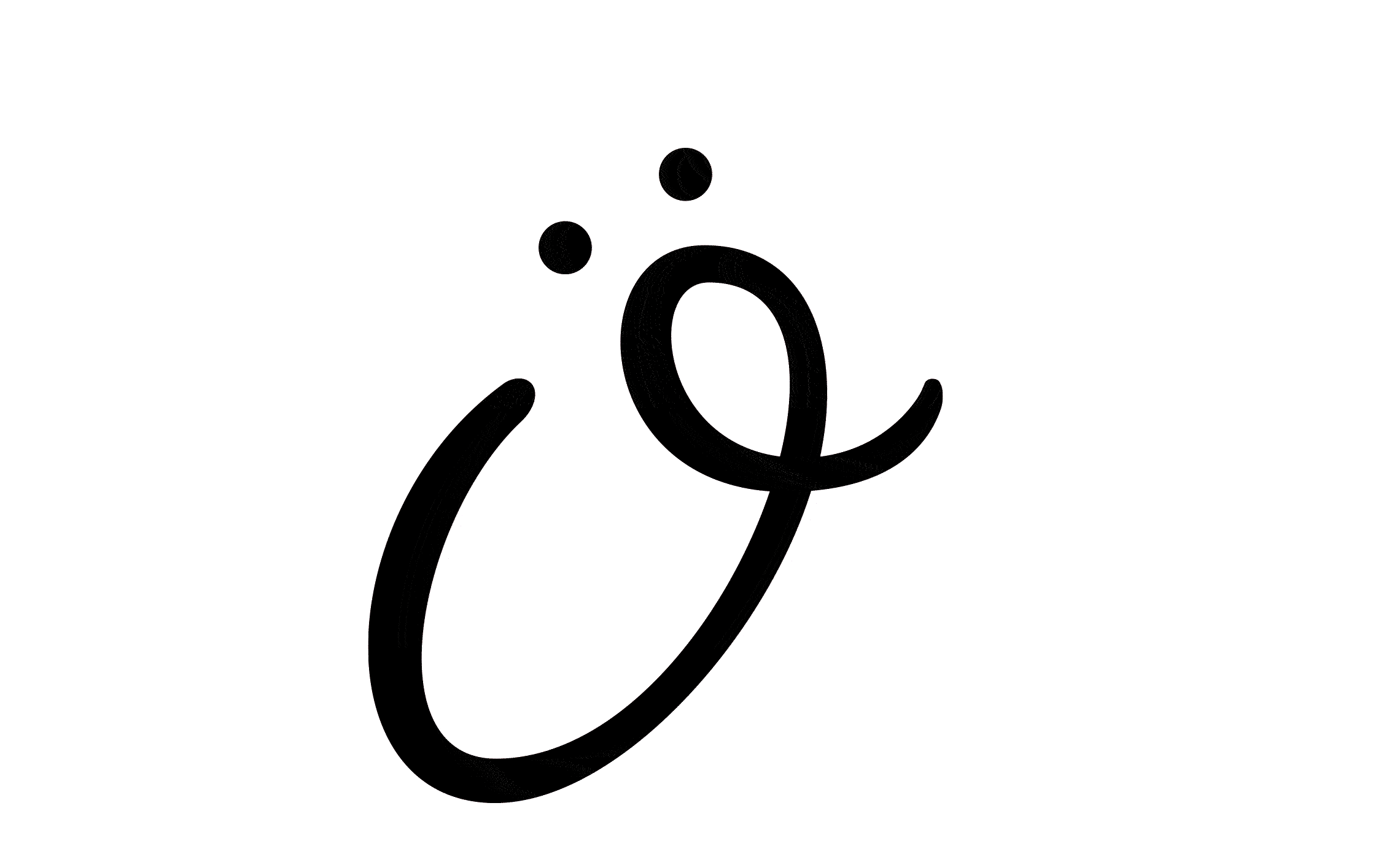
The O
Oh, the luck of having the first letter of the brand embodying perfectly the feeling of the word.

Here I use the psychological phenomenon called pareidolia, where one sees a pattern or image of something that does not exist, for example a face in a cloud, and in our case a mouth agape on a bewildered face and eyes, with the hand reaching for the mouth.
Lettering inspiration
Alina wanted a feminine vibe to the logo, the bulk of her clients being mainly women.
Also something glam, sexy, hip that could equally appeal to their boyfriends.
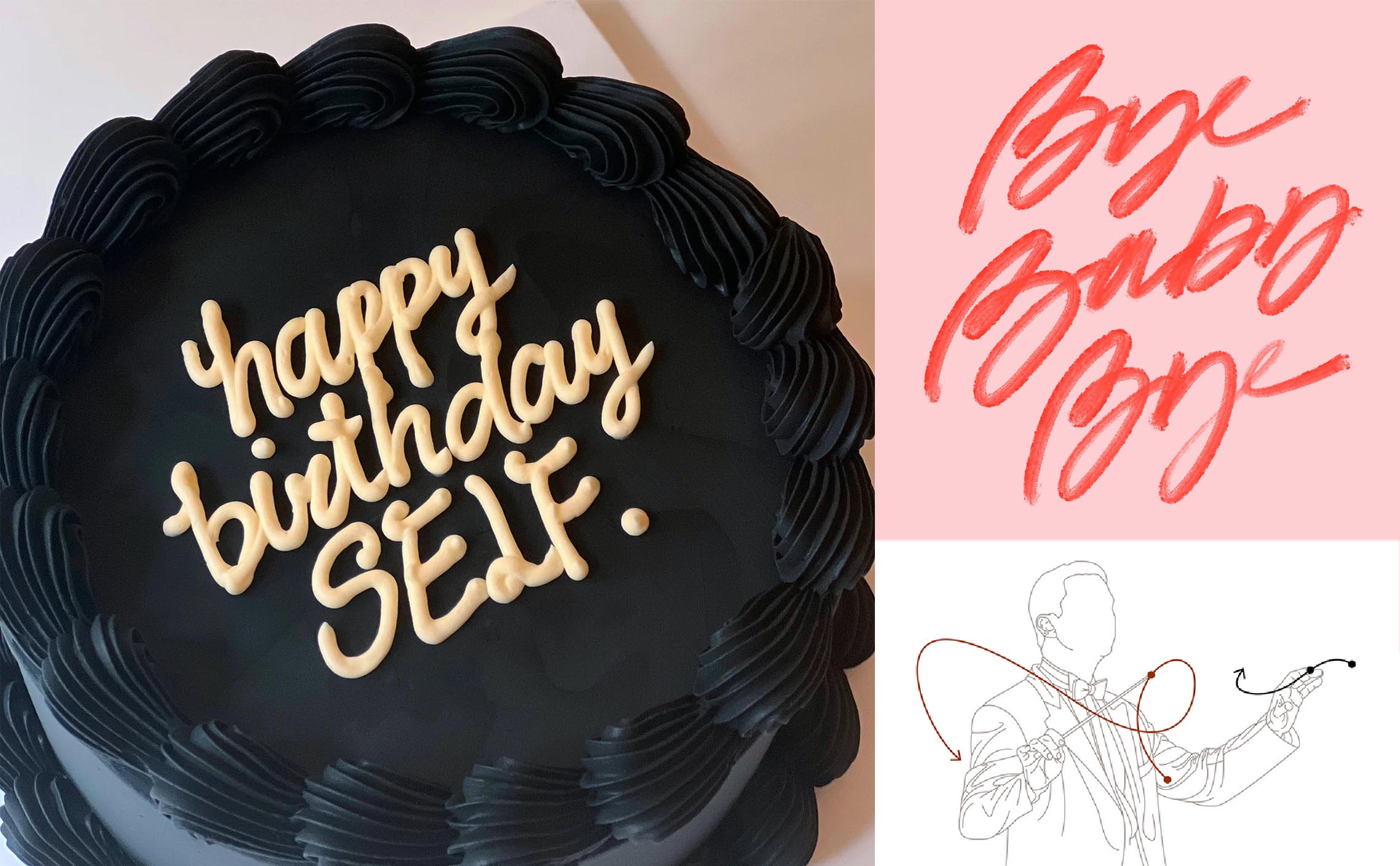
Which made me think a lipstick lettering; there's an 80's revival aesthetic to it.
And by extension, this loose and energetic style could also be seen in cake lettering with the piping bag.
Finally, this free-hand lettering curves also remind of the movements of a conductor, which is very fitting for the culinary sector where decorations, splashs of sauces and creams are often applied freely and artistically.
Construction
Constructed along a descending slope, the overal structure evokes the decrescendo when pronouncing Ohlala.
The letters are modern (straight ascenders, no bowls or loops) but remain sexy and flowing with smooth curves.
Ohlala is also written a continuous line, reminiscent of the cake piping bag.
The angle
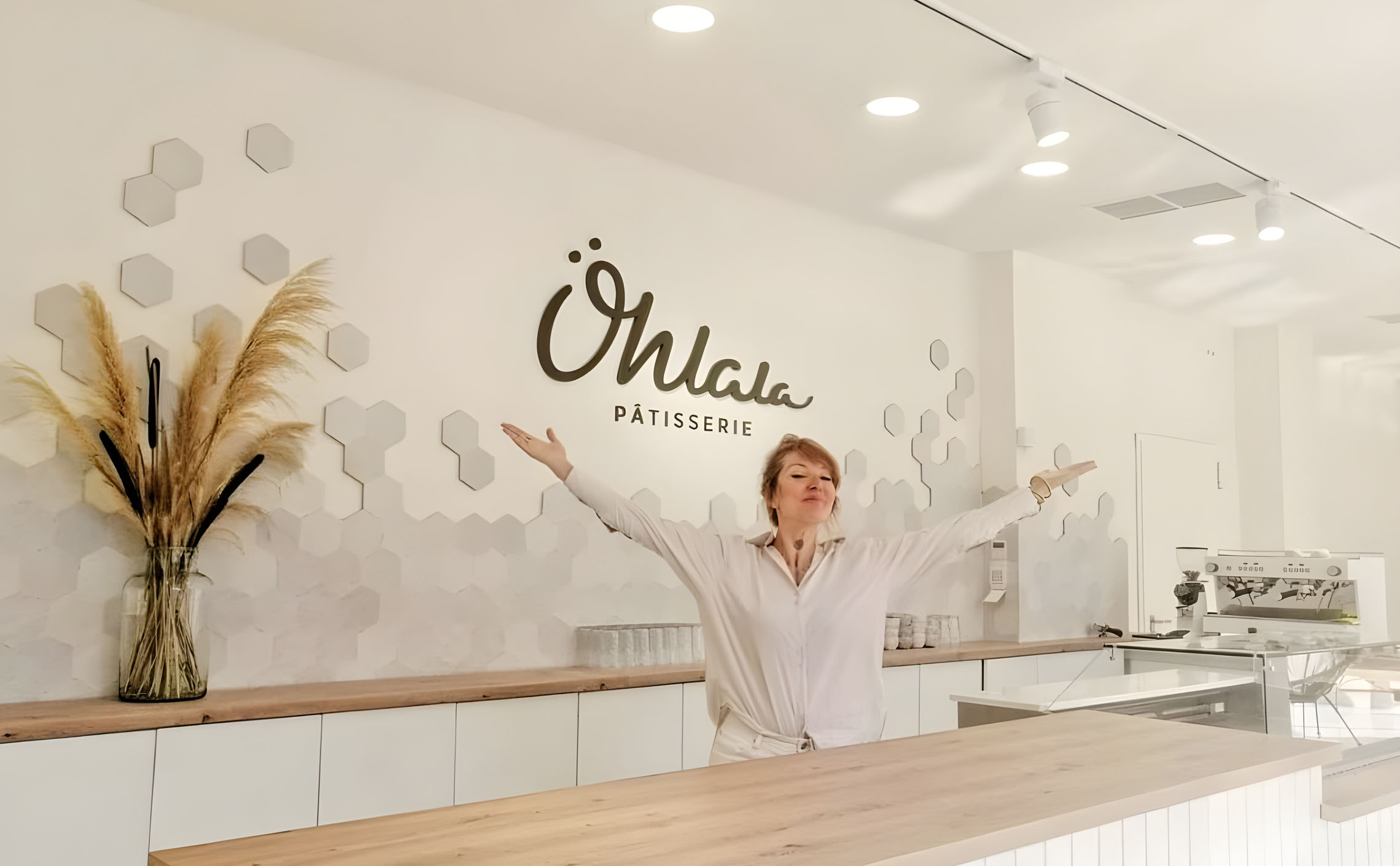
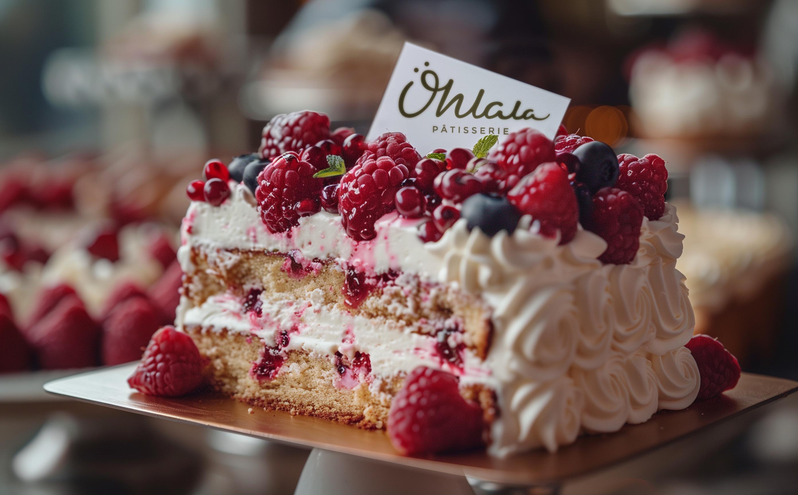
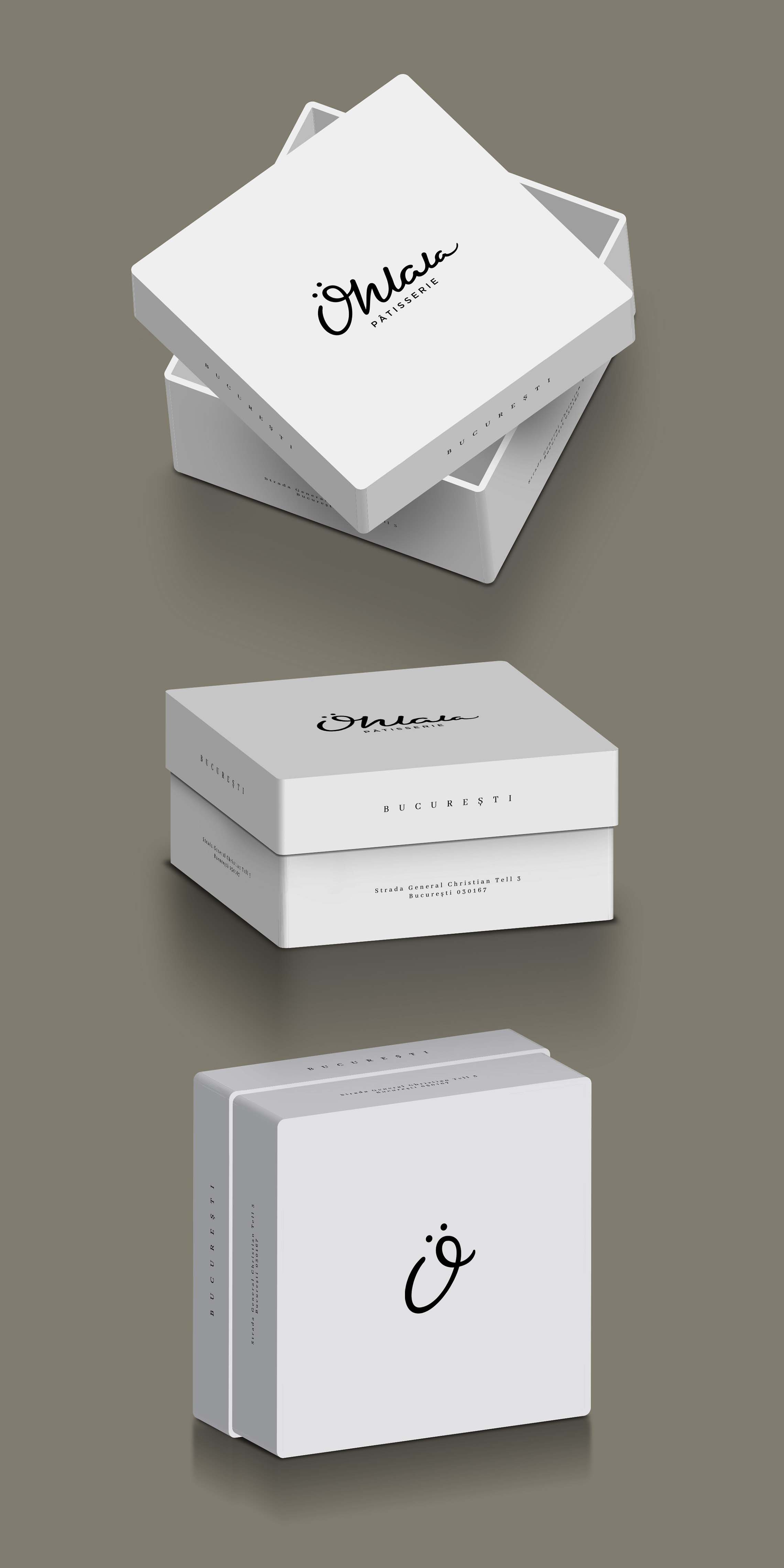
The angle at which the top of the logo is designed allows for smart and practical display solutions.
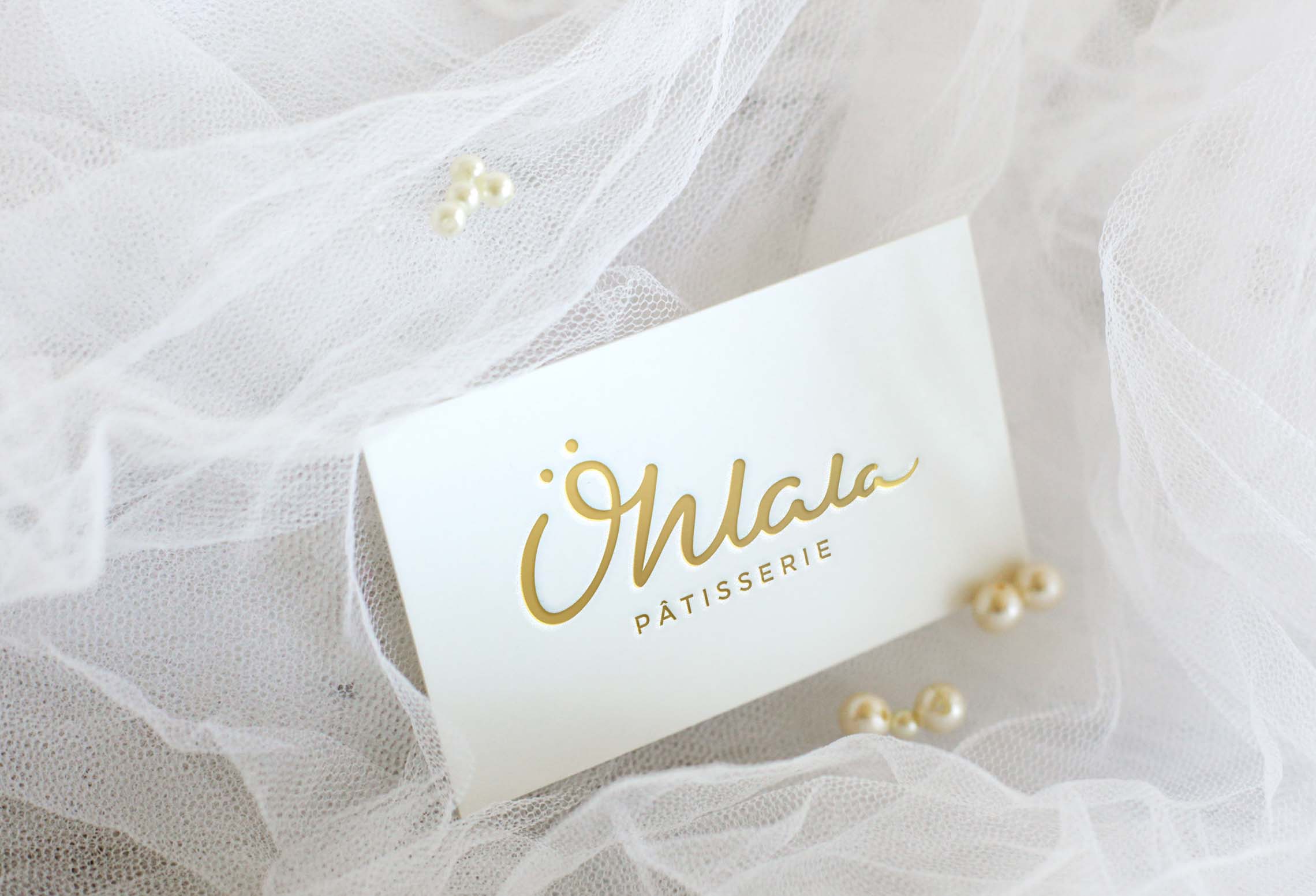
For example, we can use this visual trick to create "cake cards" with the logo to be planted at an angle on top of the cake in order to signify the provenance of the cake.
It works also very well with the business cards.
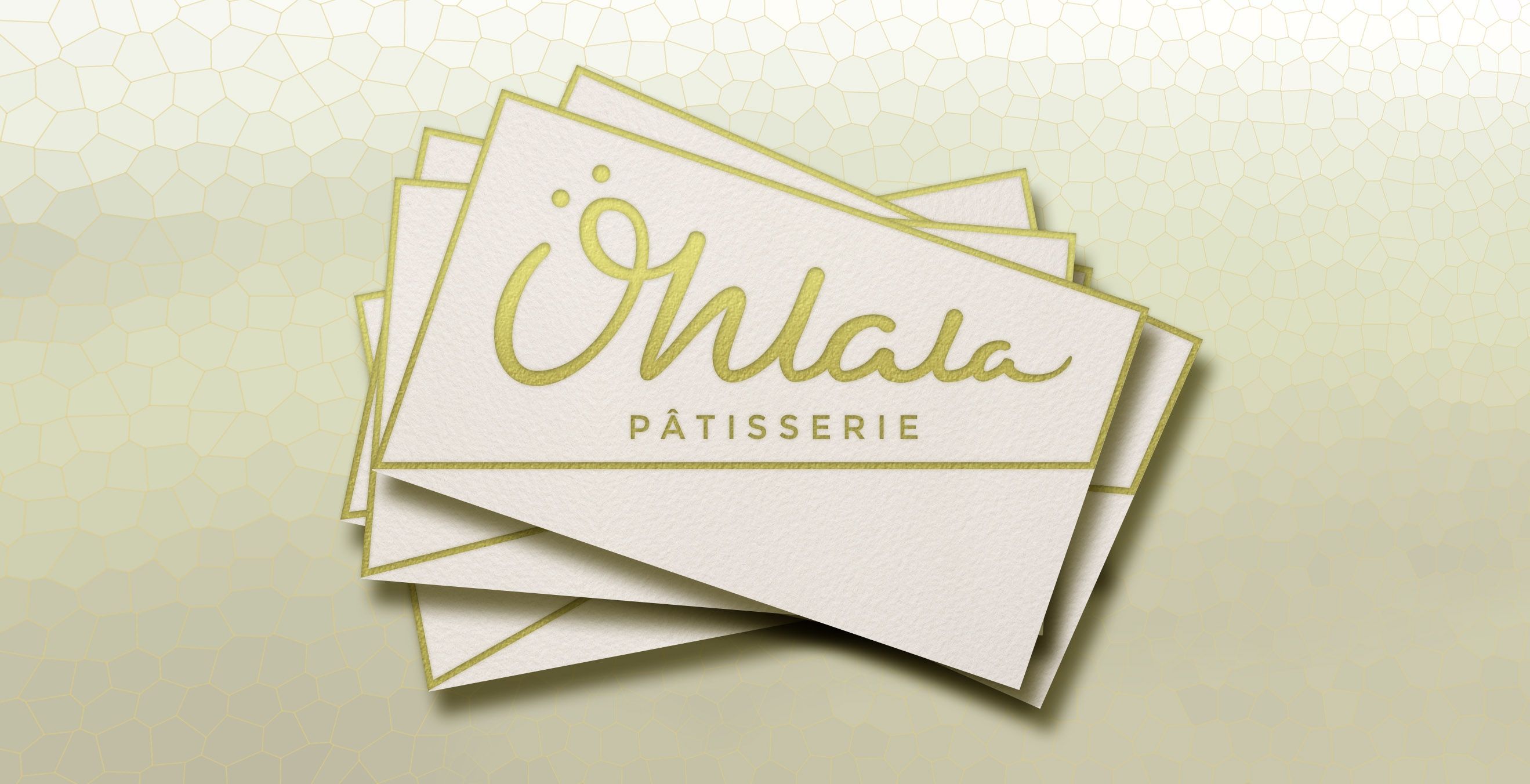
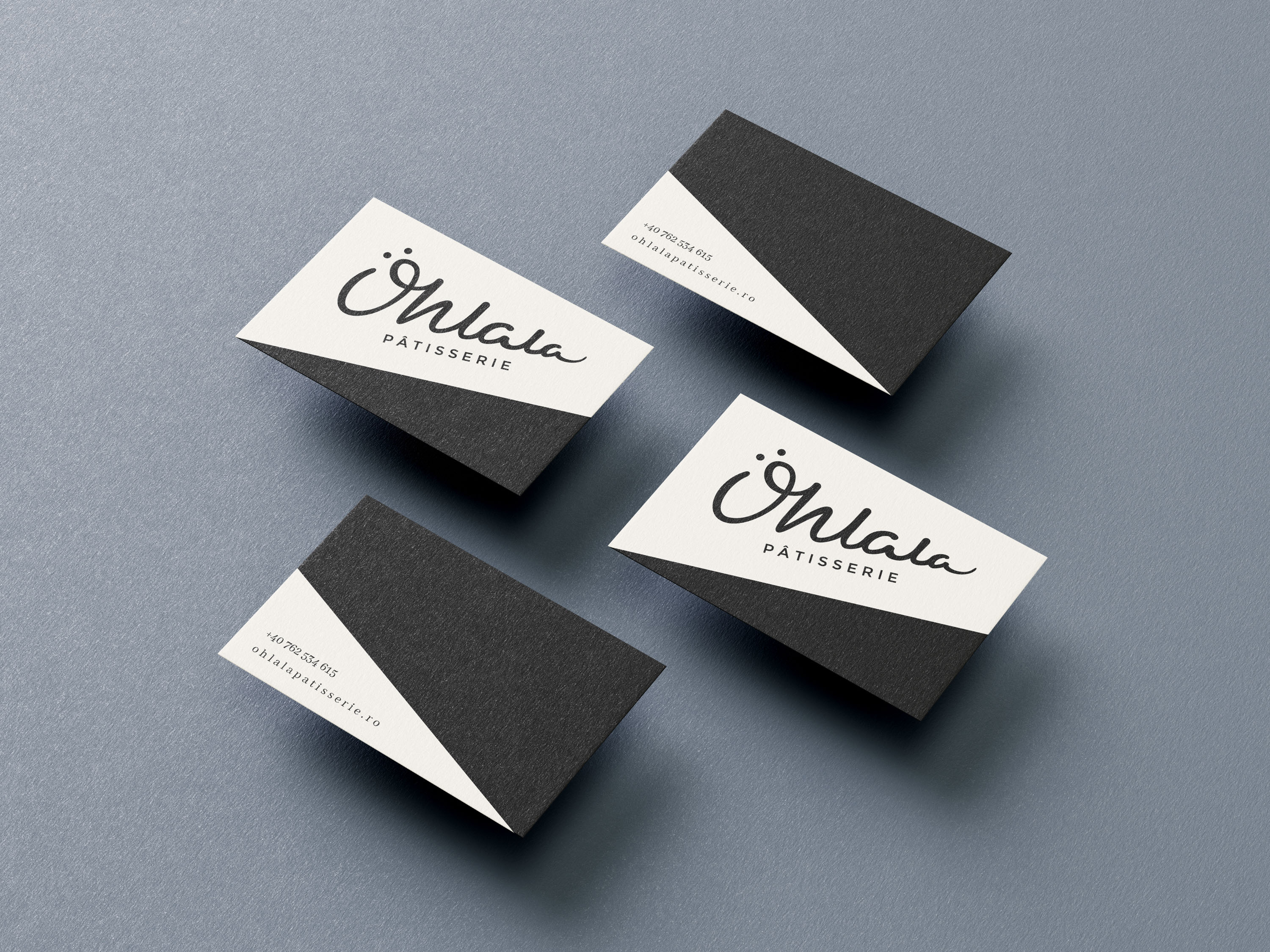
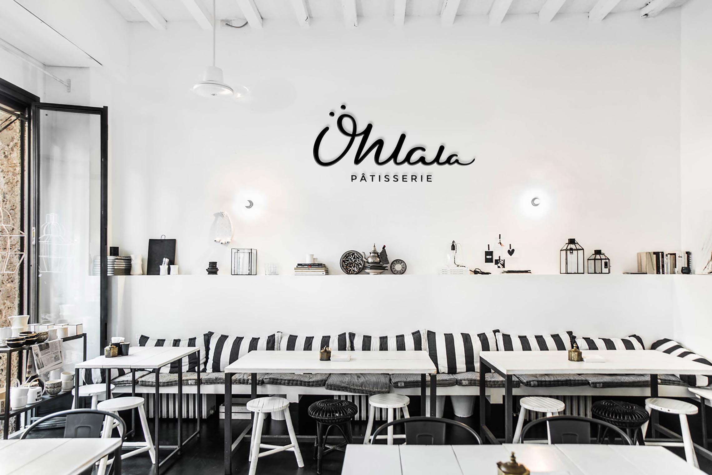
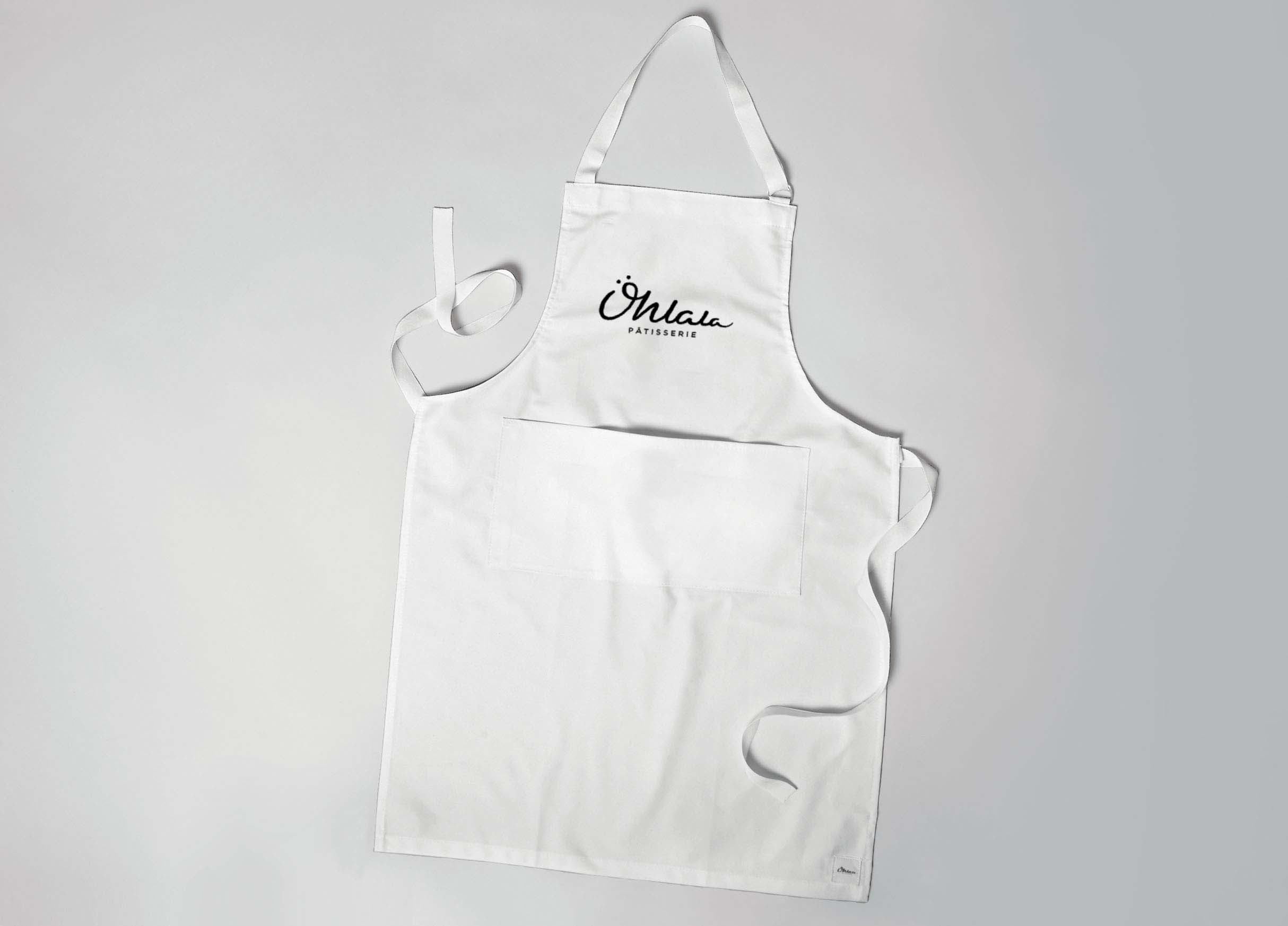
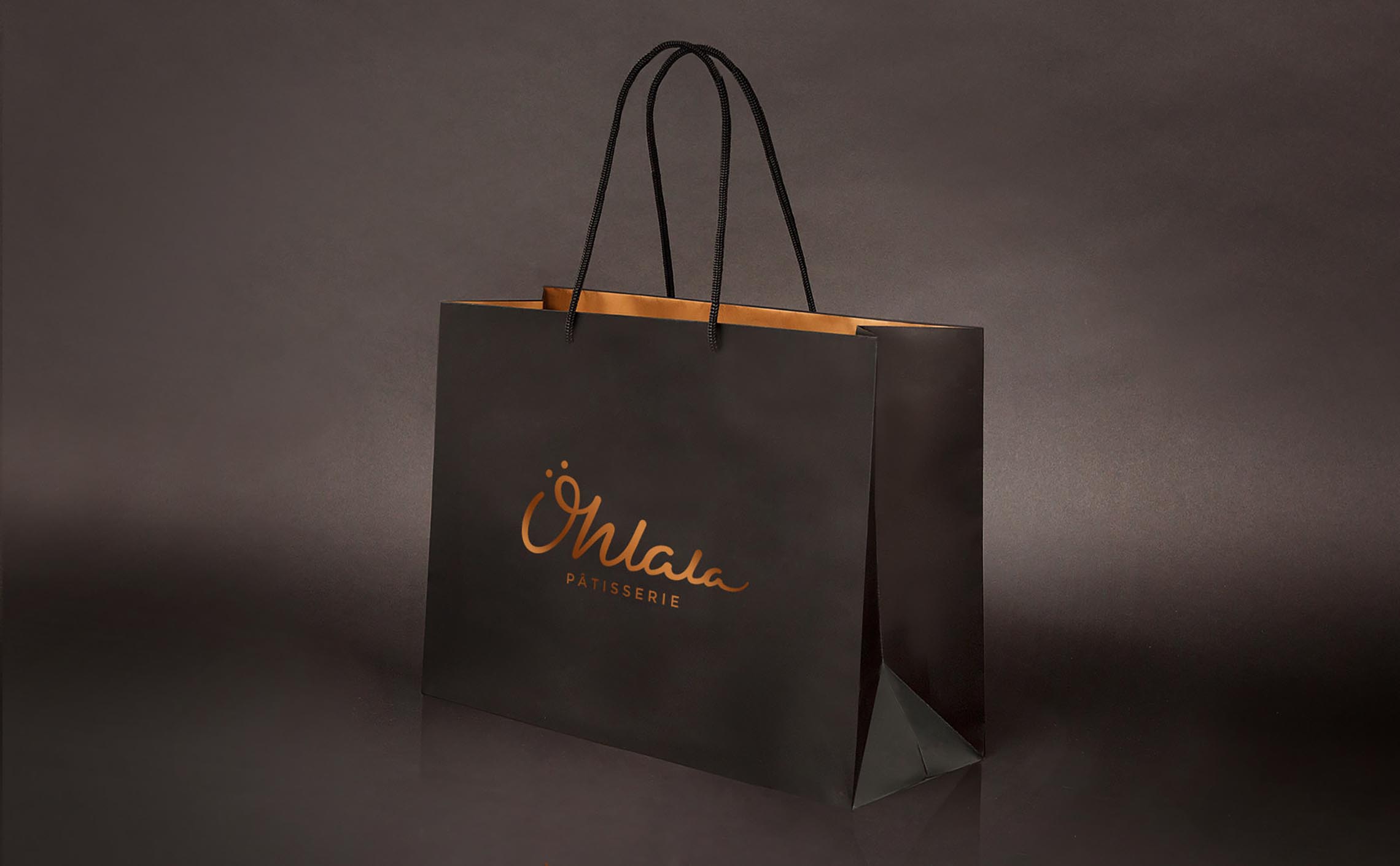
Color Scheme
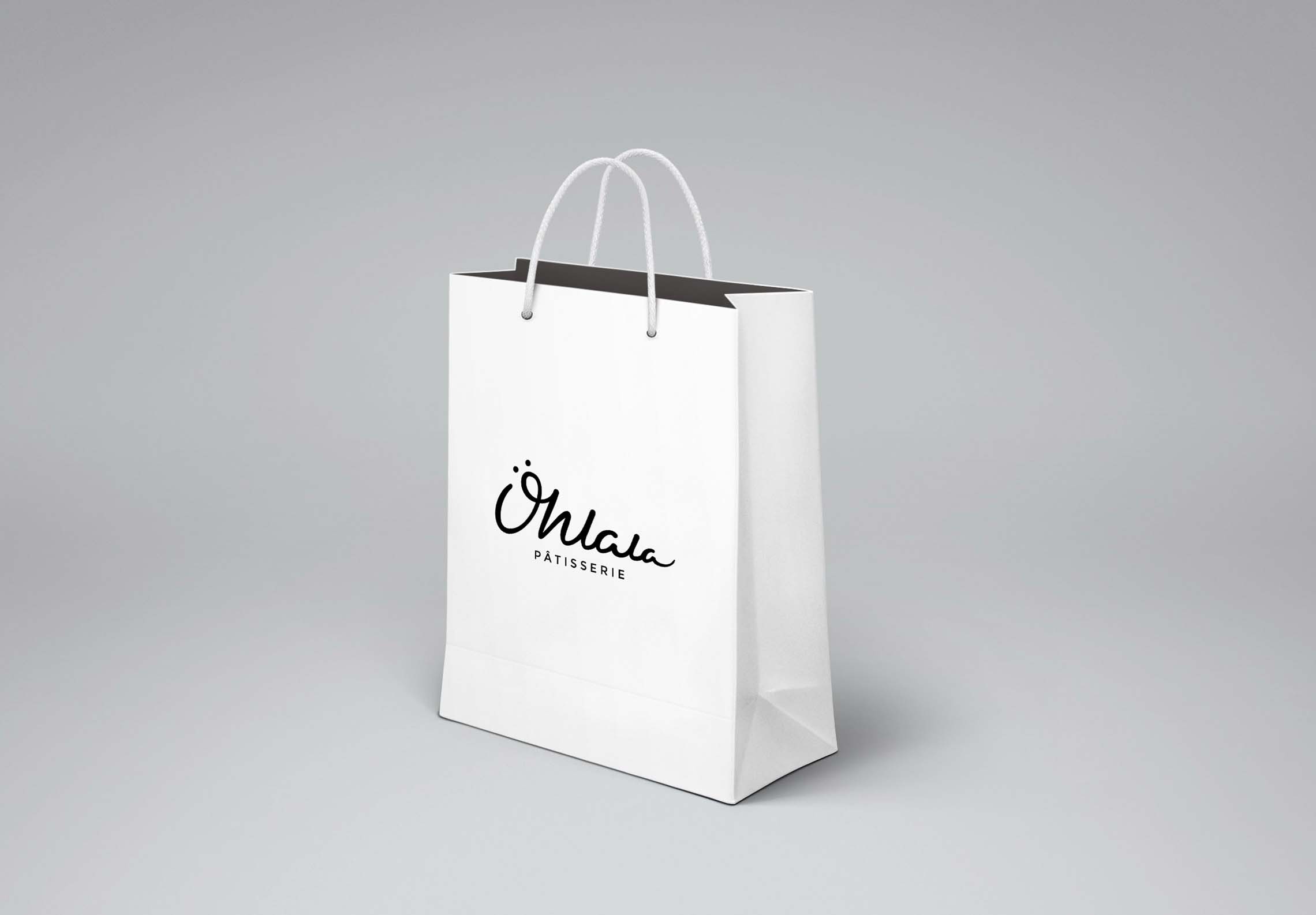
The color scheme stays mainly within black and white, a minimalist approach that allows the colors of the pastries to shine.
An off-white cream is sometimes used to soften the color palette, along with accents of gold which is a color and texture often used in the culinary world to convey excellence and refinement.

Typograhy
Primary Font: Montserrat
Montserrat is a no-fuss and elegant font, perfect for creating a sober and minimalist environment where the products can freely shine.
Secondary Font: Abhaya Libre
Abhaya Libre is more classical and bookish and perfect for body text. It adds an element of refinement that fits very well with excellence of high-end pastry.

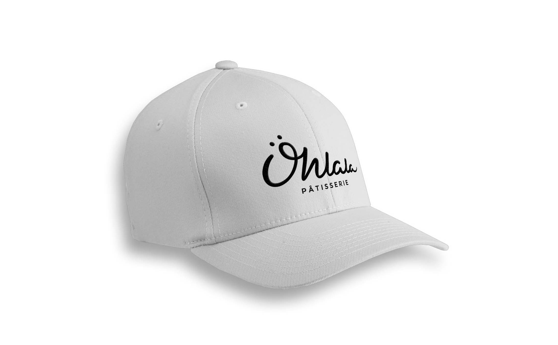
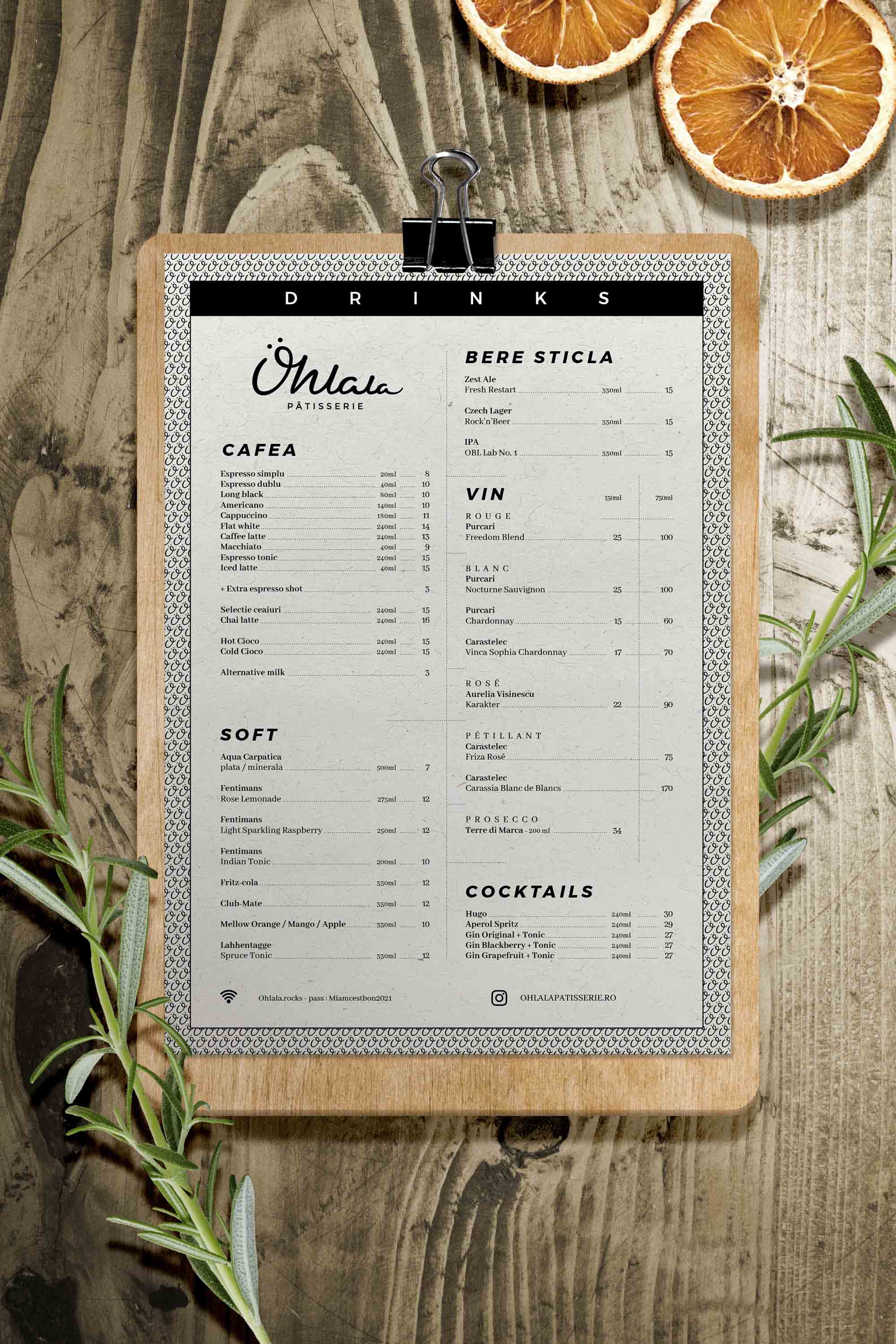
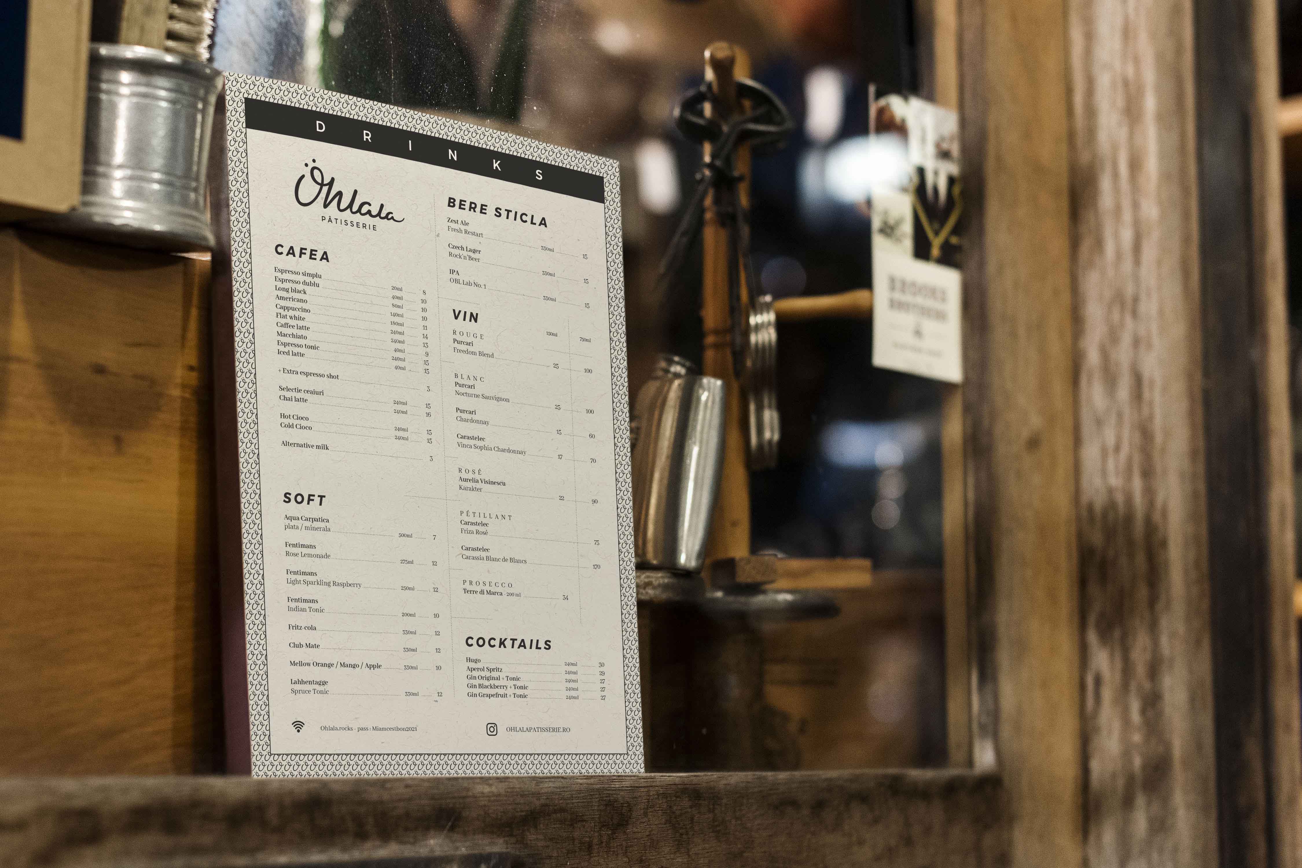
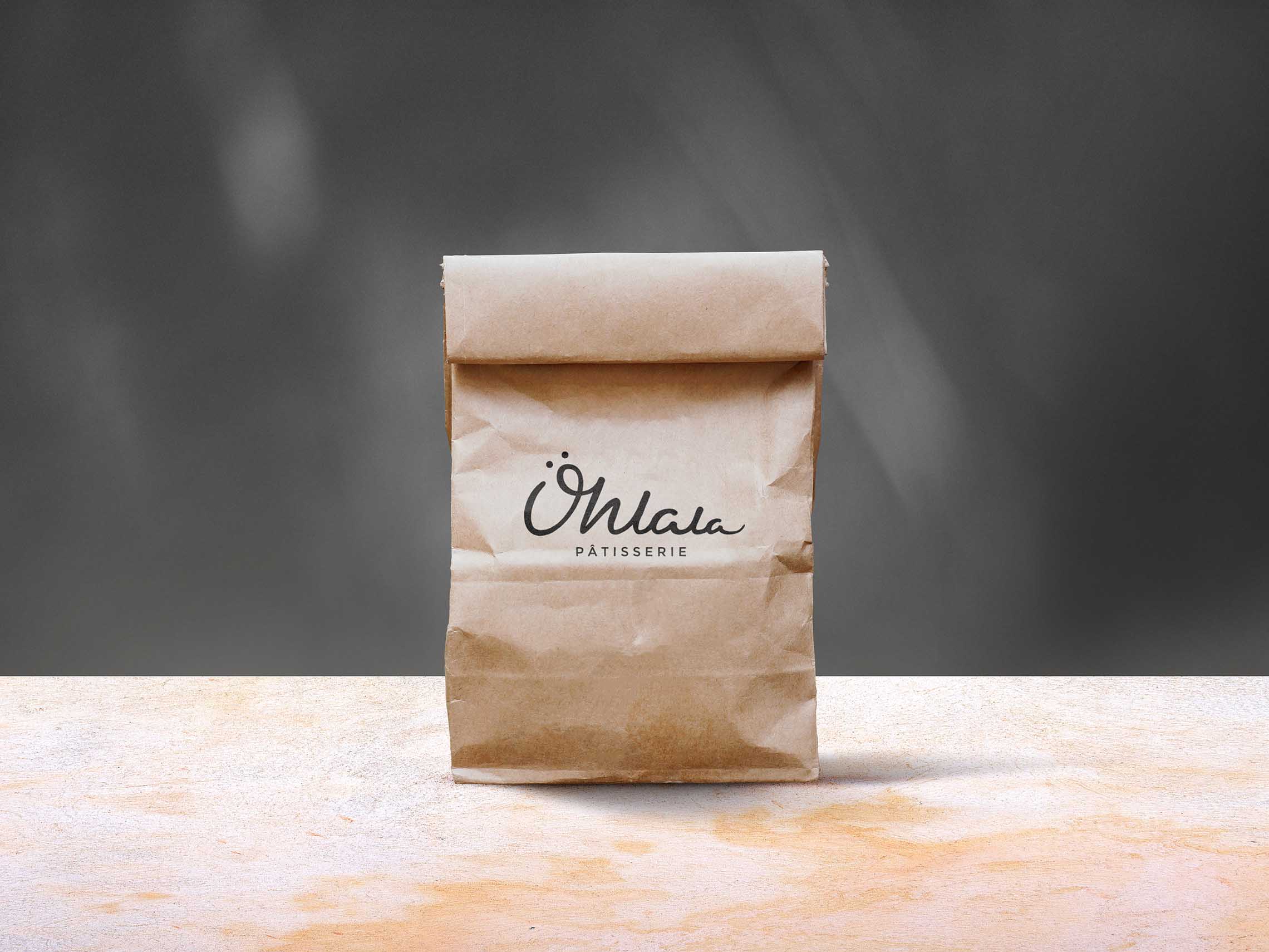
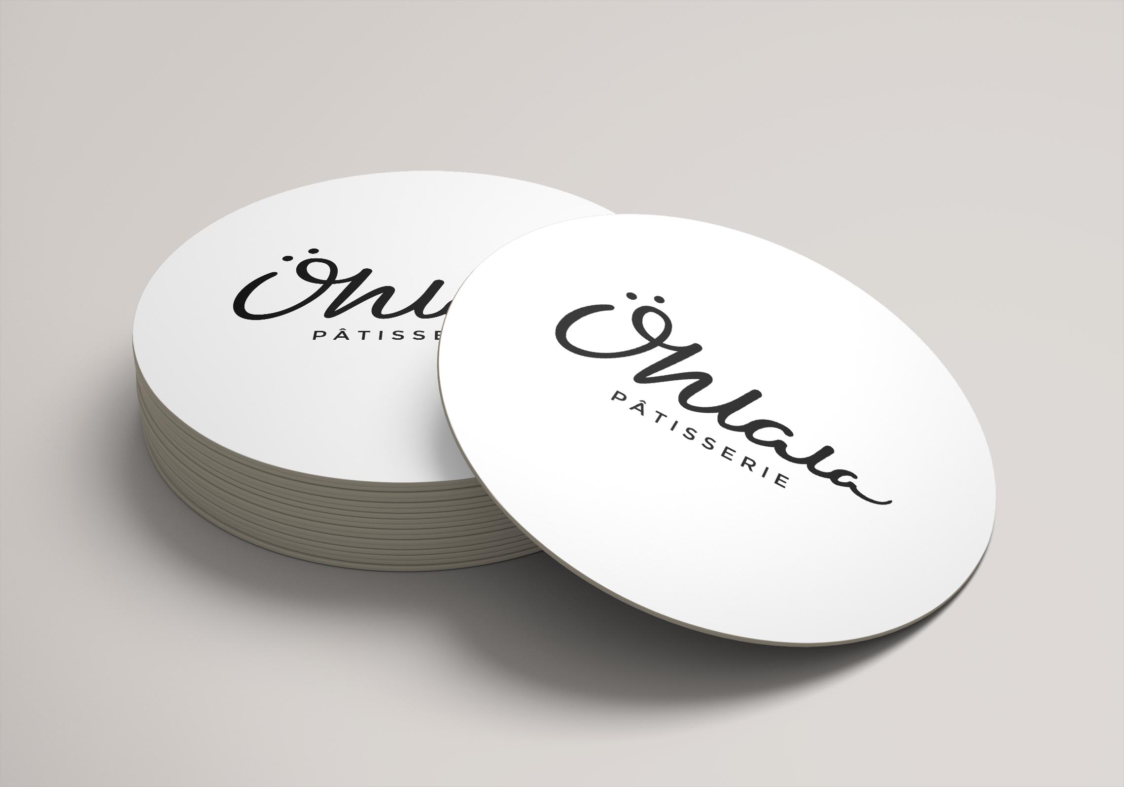
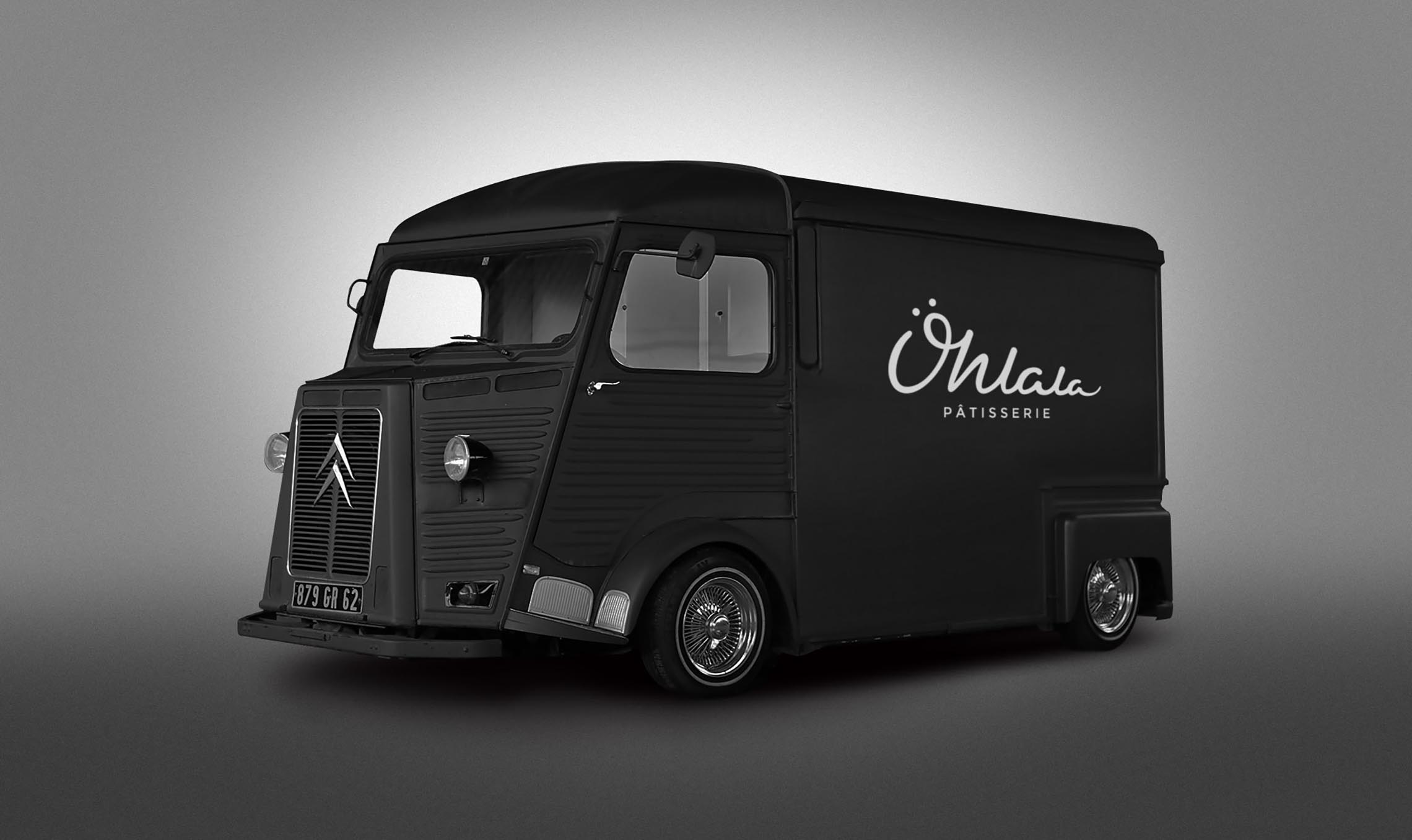
Applications
In situ applications of the branding on various mediums and situations.

Related projects:
Greystone
Golden Gator
Sérêvène
Kobo